Lyndon Watkinson (1999) is an artist based in Sheffield, UK, who seeks to democratise art through collage, print, publications, design, articles, and sound. His work brings process to the forefront, appropriating imagery from everyday life, inviting the viewer to share in his memories.
In 2020, a blog post entitled Suburban Utopia, An Infertile Place formed part of the wider inquiry and development of his practice for his bachelor's degree in fine art. As his work matured, he applied this term as a formalisation of his creative endeavours, later abbreviating it to SU4IP, now used as an alias and publishing entity.
Artworks
Publications
Articles
Websites
Futures Past Coalition new!
About
Lyndon Watkinson (1999) is an artist, designer, writer, and musician based in Sheffield, UK. Democratising art and art context through artworks, publications, graphic design, articles, and sound. Creative director and founder of the online arts organisation SU4IP. His work is characterised by a desire for precision, often depicting aesthetics that celebrate and criticise the absurdity of corporatized identity, calling into question the necessity of creating false exteriors when what is not seen is often just as important.
In late 2020, a blog post entitled Suburban Utopia, An Infertile Place formed part of the wider inquiry and development of his practice for his bachelor's degree in fine art. As his work matured, he applied this term as a formalisation of his creative endeavours, later abbreviating it to SU4IP, now used as a digital alias and publishing entity.
Artworks
Publications
Articles
Websites
About
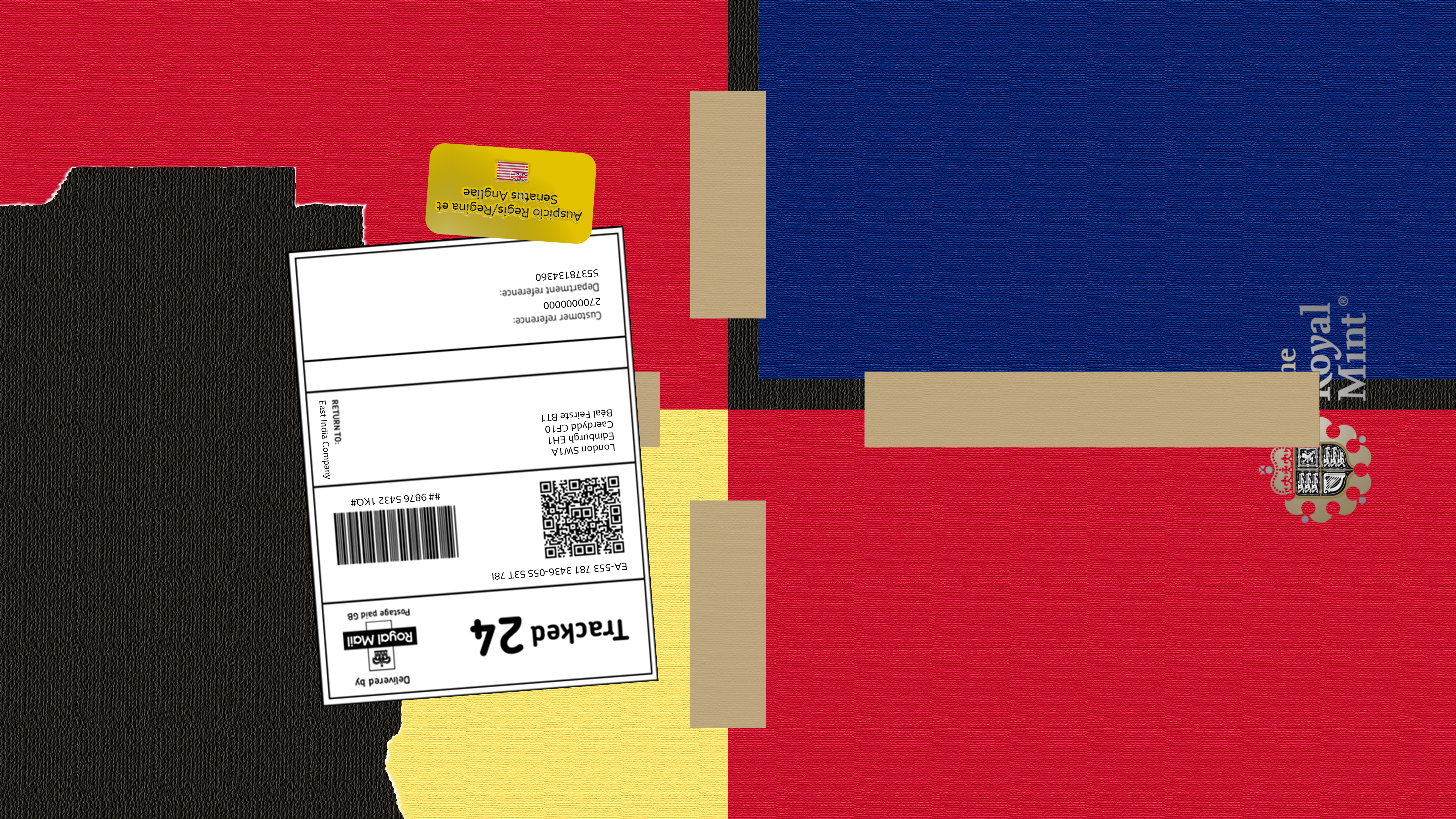
United Kingdom, Digital Collage, 2021
![]()
1. The four main sections include: England (red, bottom right); Scotland (blue, top right); Wales (yellow, derived from the Welsh coat of arms, bottom left of the centre); and Northern Ireland (red, top left). 2. All four sections are attached together with brown packing tape. This represents the fragile ties between each country within the union. 3. The background of the flag is a textured black surface, which symbolises the basis on which the UK’s economy was built: coal, and the trans-atlantic slave trade. 4. Scotland (top right) is depicted as distant but still attached to the other nations within the union to represent the increasing distance the Scottish government and people have taken from the UK over recent years. 5. The ripped-away portion of the flag in the bottom left represents the repossession and autonomous re-establishment of the Republic of Ireland, due to mismanagement and mistreatment of its people, as well as Irish nationalism movements in the 20th century. 6. The Royal Mail invoice sticker is displayed (left of centre) to continue the aesthetic trend my practice has moved towards. I used the BBC Reith font to fill in the information on the packing label. 7. The yellow sticker above the packing label reads ‘Auspicio Regis/Regina et Senatus Angliae', the slogan from the East India Company coat of arms, modified to include king and queen, to highlight the nation's transition from a colonial power to one of the most socially progressive nations in the world.
