Suburban Utopia, An Infertile Place (SU4IP)
Lyndon Watkinson
Lyndon Watkinson (1999) is an artist, designer, writer, and musician based in Sheffield, UK. Democratising art and art context through artworks, publications, graphic design, articles, and sound. Creative director and founder of the online arts organisation SU4IP. His work is characterised by a desire for precision, often depicting aesthetics that celebrate and criticise the absurdity of corporatized identity, calling into question the necessity of creating false exteriors when what is not seen is often just as important.
In late 2020, a blog post entitled Suburban Utopia, An Infertile Place formed part of the wider inquiry and development of his practice for his bachelor's degree in fine art. As his work matured, he applied this term as a formalisation of his creative endeavours, later abbreviating it to SU4IP, now used as a digital alias and publishing entity.
Artworks
Publications
Articles
Websites
About
Digital Collage, 2021
PAPERplus® (1600 x 900 px) engages with flags and representation. To save money on art materials and maintain productivity during the nationwide lockdown, surplus packaging paper and cardboard often laid the foundation for 2020–2021 artworks.
The creases and folds of the packing paper created a guide, and green and brown oil pastels were applied to create a layout akin to the flag of Liberia or the United States of America. These colours would ultimately serve to accentuate the materials and text underneath, rather than cover them up.
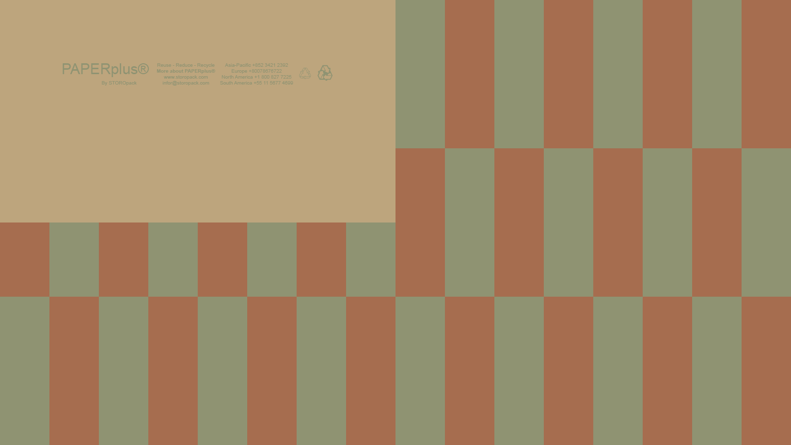
︎ Due to the uncertainty of this pandemic, I was aware that having a reliable source of materials to work with could be difficult, so I decided that I would save all suitable cardboard, paper, and plastic packaging.
Inside one package I ordered were long, scrunched strips of packing paper. I left them under my mattress for a few days so that they flattened. I noticed that when all three lined up with each other, they formed a similar aspect ratio to that of a flag. Furthermore, the indentations and scrunch marks on the paper formed a natural grid for me to follow when I designed my flag.
I instead decided to tape them together along the back with electrical tape. This worked out quite well because it meant that the adhesive I used for this piece wouldn’t interrupt or affect my addition of colour.
Once it was assembled, I used Photoshop to draft how I wanted this flag to look, as I knew I only had one chance to get it right. The brown and green on the Photoshop render of my flag were sampled directly from the image. While I understand I wouldn’t be able to replicate this in real life, the idea of colour sampling is becoming more popular. I think representation should be derived exactly from the colour of what it represents, unlike most widely accepted flag designs.
After planning how I wanted my flag to look, I proceeded to pin the flag onto my pin board and draft the layout with a marker pen before adding alternating green and brown oil pastels. On the initial render of my flag, I had filled the top left section with white, with a green PAPERplus ‘P’ logo in the centre; in the physical flag, I chose to keep this section blank. This is because, firstly, I noticed how, despite the flag design running across multiple packing strips, my flag design almost perfectly framed the PAPERplus logo and contact information. I realised the art was already there. By colouring over the other PAPERplus contact information on this piece, I isolated and accentuated only one. Adding anything to this section would have, in my eyes, thrown the piece off balance.
I began to think about representation. If this flag were a representation of PAPERplus packing paper, why would I choose to frame or accentuate any other colour, texture, or symbol to represent it when it was already there? A problem within vexillology began to arise. Flags are often a glorification of a geographical location rather than a representation. How so? The United States of America, a flag that inspired this piece, had infiltrated my consciousness the day I looked at Jasper Johns’ Flag in more detail. The power of that piece was derived not from its accuracy or display of craftsmanship but from the context of the time it was created. Through its irony. A flag symbolising the unity of 50 completely unique and, to this day, conflicting states. The audience can conclude from this piece that perhaps this flag isn’t entirely representative of its nation.
Similarly, the blue in the flag of Shrewsbury is not derived from the blue of the great River Severn that surrounds it, a natural barrier that played an instrumental role in maintaining English control of the town for centuries. It is not derived from a local flower or ancient tradition. It is the blue of Roger de Montgomery, the Earl of Shrewsbury at the time this flag was conceived, who was not even a native Salopian to begin with. This shade of blue has only become synonymous with the town due to its age and not due to any tangible local ties to the area. Why should the flag of PAPERplus packing paper consist of anything other than the packing paper itself? I would admit that, in retrospect, adding my own shade of green or brown to this piece for any reason other than framing the PAPERplus logo and contact information would have been a mistake, had I not arrived at this idea of false representation in flags as a result.