Suburban Utopia, An Infertile Place (SU4IP)
Lyndon Watkinson


Lyndon Watkinson (1999) is an artist, designer, writer, and musician based in Sheffield, UK. Democratising art and art context through artworks, publications, graphic design, articles, and sound. Creative director and founder of the online arts organisation SU4IP. His work is characterised by a desire for precision, often depicting aesthetics that celebrate and criticise the absurdity of corporatized identity, calling into question the necessity of creating false exteriors when what is not seen is often just as important.

In late 2020, a blog post entitled Suburban Utopia, An Infertile Place formed part of the wider inquiry and development of his practice for his bachelor's degree in fine art. As his work matured, he applied this term as a formalisation of his creative endeavours, later abbreviating it to SU4IP, now used as a digital alias and publishing entity.

Artworks
Publications
Articles
Websites

About
October,

Digital Collage, 2021

October is my recorded experience of October 2021. This piece compiles material from archives and daily objects.

The orientation of the work is in reference to the sceptical financial nature of October, alluding to a bullish accumulation pattern in the way the components are arranged.
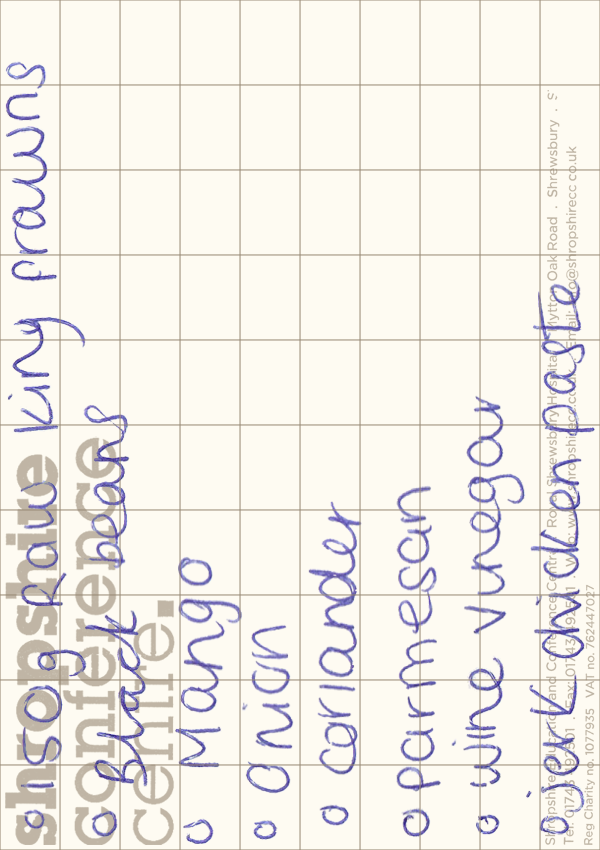


︎    October is based on the notebook I use to plan my days. Throughout October, blue biro was my pen of choice, representing the colours of the month in my daily experience. The handwriting and Shrewsbury Conference Centre graphics were derived from a shopping list drawn on a scrap piece of paper from the Shrewsbury Conference Centre.

The way the elements in this piece are oriented is in relation to October, the beginning of Q4, the start of the final phase of the market cycle, which historically has seen optimistic upward trends. The layout of the text in this image, when oriented in this way, resembles an upward accumulation curve. October combines elements from various aspects of my daily experiences during this 31-day period.