Lyndon Watkinson (1999) is an artist based in Sheffield, UK, who seeks to democratise art through collage, print, publications, design, articles, and sound. His work brings process to the forefront, appropriating imagery from everyday life, inviting the viewer to share in his memories.
In 2020, a blog post entitled Suburban Utopia, An Infertile Place formed part of the wider inquiry and development of his practice for his bachelor's degree in fine art. As his work matured, he applied this term as a formalisation of his creative endeavours, later abbreviating it to SU4IP, now used as an alias and publishing entity.
Artworks
Publications
Articles
Websites
Futures Past Coalition new!
About
Lyndon Watkinson (1999) is an artist, designer, writer, and musician based in Sheffield, UK. Democratising art and art context through artworks, publications, graphic design, articles, and sound. Creative director and founder of the online arts organisation SU4IP. His work is characterised by a desire for precision, often depicting aesthetics that celebrate and criticise the absurdity of corporatized identity, calling into question the necessity of creating false exteriors when what is not seen is often just as important.
In late 2020, a blog post entitled Suburban Utopia, An Infertile Place formed part of the wider inquiry and development of his practice for his bachelor's degree in fine art. As his work matured, he applied this term as a formalisation of his creative endeavours, later abbreviating it to SU4IP, now used as a digital alias and publishing entity.
Artworks
Publications
Articles
Websites
About
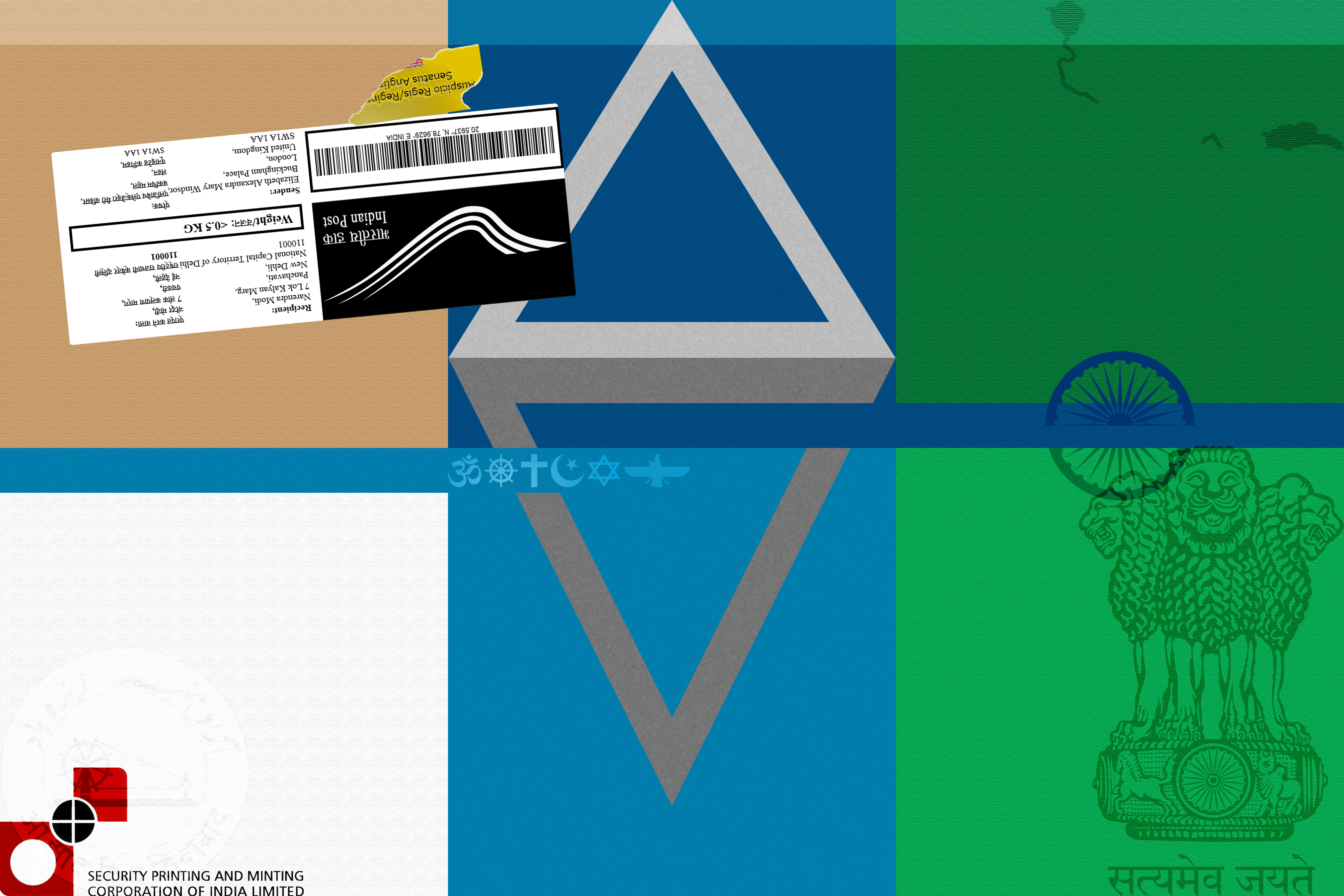
India, Digital Collage, 2021
![]()
1. India is a huge nation with 28 internal administrative divisions; therefore, I modelled this flag around its physical geography, as opposed to its political geography. The six sections represent the six zones into which the nation is divided. Their respective colours are based on the climate or terrain most prominent within them. 2. The two grey triangles in the centre of the flag represent the cold Himalayas to the north, with the bottom triangle representing the intersecting Western Ghats, Eastern Ghats, and the Vindhya Range. 3. The horizontally thin blue regions that cross the flag represent the River Ganges, which spans the nation. The ‘Ashoka Chakra’ makes an appearance here, half submerged in the river, to represent the rich Indian textile industry, which is supported by industrialised techniques that depend on natural sources of perpetual motion. 4. The six most prominent religions in India are also represented here, as its constitution prides itself on ensuring equal rights for all citizens, regardless of their religion. 5. I really enjoyed the aesthetic of the Indian Head of State logo; it was plastered across most Indian websites I visited as well, which led me to believe it is popular symbolism. 6. The top right of the flag features the disputed territory and border disputes India is currently facing. 7. The bottom left of the flag features a sticker of the Security Printing and Minting Corporation of India Ltd., which is responsible for the printing of the Indian Rupee. 8. The top left of the flag includes a custom India Post packing label, as well as the torn signature British East India Company sticker.