Lyndon Watkinson (1999) is an artist based in Sheffield, UK, who seeks to democratise art through collage, print, publications, design, articles, and sound. His work brings process to the forefront, appropriating imagery from everyday life, inviting the viewer to share in his memories.
In 2020, a blog post entitled Suburban Utopia, An Infertile Place formed part of the wider inquiry and development of his practice for his bachelor's degree in fine art. As his work matured, he applied this term as a formalisation of his creative endeavours, later abbreviating it to SU4IP, now used as an alias and publishing entity.
Artworks
Publications
Articles
Websites
Futures Past Coalition new!
About
Lyndon Watkinson (1999) is an artist, designer, writer, and musician based in Sheffield, UK. Democratising art and art context through artworks, publications, graphic design, articles, and sound. Creative director and founder of the online arts organisation SU4IP. His work is characterised by a desire for precision, often depicting aesthetics that celebrate and criticise the absurdity of corporatized identity, calling into question the necessity of creating false exteriors when what is not seen is often just as important.
In late 2020, a blog post entitled Suburban Utopia, An Infertile Place formed part of the wider inquiry and development of his practice for his bachelor's degree in fine art. As his work matured, he applied this term as a formalisation of his creative endeavours, later abbreviating it to SU4IP, now used as a digital alias and publishing entity.
Artworks
Publications
Articles
Websites
About
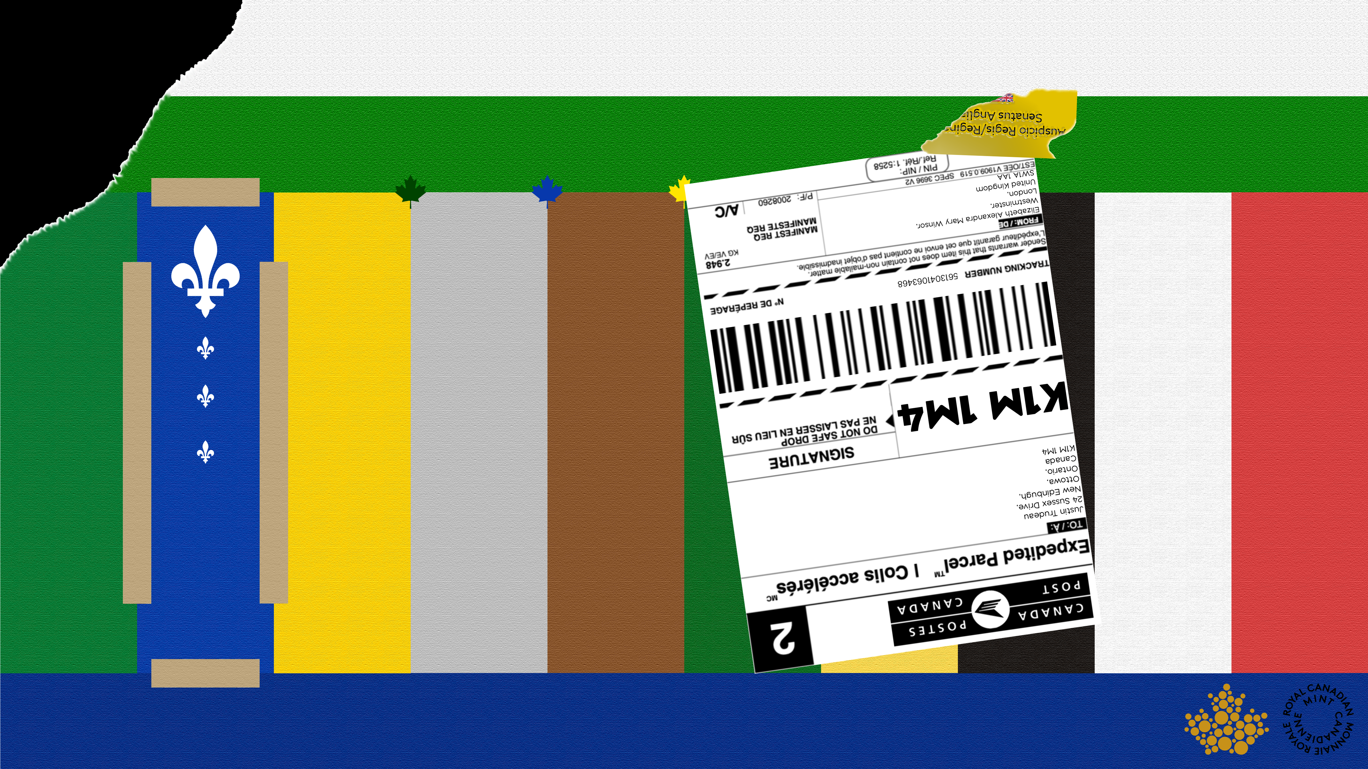
Canada, Digital Collage, 2021
![]()
1. The upper horizontal white and green bands represent the rural, uninhabitable northern region of the country. 2. The lower horizontal navy band represents how 80% of Canada’s population lives in the southern region along the United States border. 3. The 10 vertical columns represent each individual province, represented by colours sampled from their regional flags, ordered by population descending from left to right. 4. The three maple leaves intersecting the vertical columns represent the three official territories of Canada, also sampling from their respective regional flags. 5. The Quebec column is distinguishable by its signature fleur-de-lis. The column is also taped to the other columns to represent her constant fight for autonomy within Canada. 6. The top left region is ripped away to reveal a black void, representing the absence of Alaska within its borders and the concentration of oil deposits in that region. 7. The bottom right features an integrated logo of the Royal Canadian Mint. 8. The packing label is derived from Canada Post and filled in with the BlackSans font from the New Zealand flag, as the font from the CBC, Frutiger, requires that you pay for it. 9. The flag also features the ripped British East India Company sticker, a recurring theme in all flags of former British colonies.